Mar 062013
 

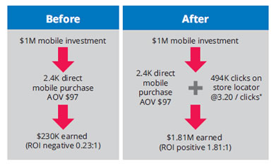
These two multi-channel retailers found that mobile store locators get feet in stores and dollars in the cash register.

RadioShack launched its mobile site in 2011, streamlining it to make it easier for shoppers to quickly find products and services. It includes a mobile, touch-optimized store locator with click-to-call and GPS functionality. After its launch, the retailer found the average order value increased by 30 percent.

An analysis of four months’ worth of data completed by RadioShack with Mindshare, its agency, found that 36 percent of clicks were on its store locator page. Based on internal data, they estimated that 40 to 60 percent of clicks on its store locator resulted in visits to a physical store. Of those who did shop at a store, 85 percent made a purchase.

Before this study, RadioShack had only tracked conversion on its mobile site; it didn’t have great visibility into how mobile search affected in-store sales. “It wasn’t a good way to capture the whole conversion process and how users are interacting. The study was trying to follow the customer through the whole experience,” says Lisa Little, RadioShack search marketing manager.

READ MORE:  RadioShack and Adidas Find Store Locators Ring Up Sales | ClickZ.


Mar 052013
 

tweetdeck

Twitter will shut down multiple TweetDeck apps to focus on the product’s web-based version, the microblogging service announced Monday.

In yet another sign of the battle between social media’s two biggest players, Facebook integration will be removed, too.

The announcement was met largely with a chorus of “nooooooooo,” “whyyyyyyy” and “gaaaaaaaah” on social media, reflecting TweetDeck’s widespread popularity with hardcore Twitter users.

TweetDeck AIR, TweetDeck for iPhone and TweetDeck for Android will be removed from their respective app stores in May, and stop working soon after, according to a TweetDeck blog post.

“To continue to offer a great product that addresses your unique needs, we’re going to focus our development efforts on our modern, web-based versions of TweetDeck,” the post says.

READ MORE:  Twitter Killing TweetDeck for iPhone and Android.


Mar 052013
 

facebook

Facebook today confirmed dwindling engagement with public posts to subscribers cited by The New York Times’ Nick Bilton, other journalists, and I, but calls us isolated cases, noting public figures with more than 10,000 fans are now getting 34 percent more Likes and comments than a year ago. While Facebook often changes the news feed to improve the user experience, the inconsistency is irksome.

So here’s the story. Yesterday, Nick Bilton of the New York Times wrote that when using Facebook’s Twitter-esque Subscribe feature to post public updates to his subscribers, he’s getting a lot fewer Likes and comments than a year ago. He suggested this is because Facebook is showing more ads instead.

Other journalists including me cited similar experiences, where our Facebook follower counts had grown significantly, but we were getting equal or less engagement now than in the months after Subscribe launched. I suggested that along with the presence of ads, people sharing more posts that compete for news feed space and Facebook’s tendency to give more feed presence to new products may have been responsible for the drought.

In a bit of damage control, Facebook sent out the following statement, hoping to frame these cases as flukes. Here’s the full-text, with my comments in brackets.

READ MORE:  Facebook Admits Likes Are Down For Some Celebrities’ Posts, But Claims Up 34% For Most | TechCrunch.


Mar 042013
 

imgres

When it comes to keyword research, there are a number of great articles out there telling you where to look, what tools to use, and how to get started. Instead of focusing on the traditional tactics, I want to focus on some other ways businesses can identify and evaluate keywords using real customer data.

Internal site search

If you have an internal site search function, you’re potentially sitting on a wealth of keyword data. Visitors coming to your website or blog often use the site search function to find information on the company and its products, or to locate pieces of content they’ve read before.

The great thing about site search is it not only helps you discover keywords your customers are using, it can also help you identify navigational or content issues. If your customers are searching for something, it likely means they are having trouble finding what they are looking for. Does that content exist on the site? If so, you need to make it easier to locate. If it doesn’t, get cracking!

Google Analytics will track these internal searches for you. To enable site search, go to your profile settings and set to “Do Track Site Search.” If you need help identifying parameters, head over to the Google Analytics site for more information.

READ MORE:  3 fresh ways to look at keywords – iMediaConnection.com.


Feb 192013
 

 putlook-image

Outlook.com officially launched Tuesday, marking the demise of its predecessor, Hotmail.

Nearly seven months after unveiling a preview of the email service last July, Microsoft announced the end of its beta run in a blog post.

Microsoft, which acquired Hotmail in 1997, said it will switch users to the new service “soon,” but won’t force them to change their emails to an “outlook.com” address. It added that all users should expect to see the change take place by this summer.

“Everything from their @hotmail.com email address, password, messages, folders, contacts, rules, vaation replies, etc. will stay the same, with no disruption in service.”

The software giant also revealed that over 60 million people are actively using Outlook.com.

READ MORE >>  Outlook.com Officially Replaces Hotmail, Boasts 60M Users.


Feb 192013
 

android-ios

Justin Ferrell, mobile strategist and developer at Digital Relativity, explains the fundamental differences between the user expectations of today’s most popular mobile platforms, and illustrates how developers can build cross-platform applications without neglecting the user experience

The words “cross-platform development” have a somewhat negative connotation within the mobile development community. When we think cross-platform, we immediately think of compromising designs and user experiences, with poor performance that caters to the lowest common denominator of device. There are so many people doing cross-platform development badly that we’ve started to assume that all cross-platform development is bad.

Like all things, there are bad examples of cross-platform development and design. But there are also some very good examples of applications that use cross-platform technologies and techniques.

Companies like Xamarin offer great cross-platform development products

Before we can understand going across platforms, it’s important that we understand the platforms themselves, the fundamental differences and what sort of experience they create for the end user.

READ MORE >> Dos and don’ts of cross-platform mobile design


Feb 192013
 

mailonline

WITH ITS FOUR-FOOT-LONG HOME PAGES AND HUNDREDS OF SIDEBAR IMAGES, THE MAIL ONLINE BREAKS EVERY RULE OF WEB DESIGN. IT’S ALSO WINNING THE WEB AND DESIGN AWARDS.

During the average workday, I allow myself to take a couple “Internet breaks,” little bursts of Tumblr and Gawker and other forms of web candy that tug at my attention span like a needy kid. There’s one web threshold I never step over on a weekday, though: the Mail Online. The online outlet of the British tabloid is a one-way ticket to an hours-long surfing spree of celebrity gossip and moral outrage. It’s not web candy–this is web crack.

And it’s not just me. The Mail Online now outperforms The New York Times, The Guardian, and pretty much every other online news property in terms of unique visitors. It generated almost $40 million last year, an increase of 500% since 2008. I’ve always wondered at the remarkable magnetic pull of the website, which isn’t particularly beautiful and isn’t known for its in-depth reportage. “Mail Online breaks just about every web design rule in the book,” Jakob Nielsen yes, that Nielsen has said of the site. Yet, as Nielsen adds, “the traffic figures speak for themselves.” What keeps so many of us coming back for more heaping servings of non-stories, even when we know that’s what we’re getting?

MORE:  4 Lessons From The Web’s Most Ruthlessly Addictive Site


Feb 052013
 

internet-web

If you ever need a quick scratchpad to just write, not save what you write, but just write, you can quickly turn your web browser into an ultra-basic notepad with a single line of HTML.

This clever trick comes from developer Jose Jesus Perez Aguinaga who says that “sometimes I just need to type garbage. Just to clear out my mind. Since I live in the browser, I just open a new tab and type”

data:text/html, <html contenteditable>

Thanks to the HTML5 contenteditable attribute and the modern browser’s ability to handle data URIs, your browser is now a notepad — just click to type.

MORE:  Turn Your Browser into a Notepad With a Single Line of HTML5


Jan 242013
 

tumblr-icon

As a favorite hangout for the Millennial generation, Tumblr is already helping some brands reach this prized audience. (Check out some of the brands already on Tumblr here.) Every industry — from fashion to finance — is represented, and these companies are finding new and creative ways to connect to their customers using this platform.

Let’s take a look at a few of the opportunities your brand might be missing on Tumblr, as well as the brands that are getting it right.

Go native

Tumblr isn’t like any other social network, so a content strategy applied to Facebook, Twitter, or a blog won’t yield the same results on Tumblr. The most popular form of expression on the platform is visual — photos and GIFs (animated images).

To be successful on Tumblr, you first need to find a way to express the visual elements of your brand or message. This approach can showcase a different side of your brand, allowing you to communicate your brand’s personality in a new way. Striking images garner a great deal of attention on Tumblr.

MORE:  4 brands that are taking Tumblr by storm


Jan 172013
 

javascript-logo

Karl Schellenberg demonstrates how to stagger full-site animations with CSS3 and JavaScript through page scrolling

When we redeveloped our new website, we decided to use CSS3 animations to provide an impressive and interactive site experience. However, we struggled to time the animations to trigger at the right time.

Because animated elements “below the fold” (depending on the screen resolution) animate on page load, some animations had already played before the user had chance to scroll to them.

To prevent this, we delay the animations until the user can see them. The animations trigger as the user scrolls down and the elements come into view, which creates a staggered effect. To do this we used specific classes for CSS3 Transitions and some JavaScript to trigger the correct elements during scrolling.

MORE:  Getting CSS animations to trigger at the right time