May 282013


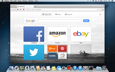
Opera has built a new Web browser from the ground up, and it’s available now on Windows and Mac.

The new Opera, which the organization is calling Next, its channel for what used to be known as “beta,” was built from scratch, it claims. What has resulted is a much cleaner interface and a host of features that Opera says, will make it easier for users to find contents.

The big change is that Opera has replaced its proprietary engine Presto with the Chromium engine. That will allow the company’s browser to load more quickly and handle slow network connections more effectively.

MORE:   Opera Next makes its debut on Windows, Mac | Internet & Media – CNET News.


May 212013
 

 facebook

Since the beginning of last year, we’ve seen a steady increase in the number of ad placements and supported platforms available to advertisers on Facebook. Now, knowing what options you have at your disposal is more important than ever!

Facebook took improvements in ad space pretty seriously and implementing these changes proved to be a successful – Facebook’s mobile efforts, in particular, are starting to achieve impressive results.

During the first quarter of 2013, 30% of Facebook’s ad revenue came from mobile devices, rising from 23% during the previous quarter and 14% the quarter before that. In the first quarter of 2012, Facebook mobile constituted 0% of its total revenue. The company has also begun focusing more on ads in the News Feed, opening up a lot of opportunities for advertisers.

Ad Placement Options

Currently, there are six different ad placements available to advertisers:

Homepage

All Facebook

News Feed (desktop, mobile)

Typeahead

Logout Page (available only through Facebook IO)

MORE:   Know Your Place! Where to Put Ads on Facebook | Social Media Statistics & Metrics | Socialbakers.


Mar 112013
 

 opera

Last month Opera announced it would be abandoning the Presto rendering engine that has been the basis of the browser since its inception. Instead the company will use the WebKit rendering engine for all its future releases, starting with this Opera Mobile for Android beta.

The revamped Opera for Android isn’t just different under the hood, Opera has redesigned the entire browser from the ground up opting for a more Android-native look. The new user interface is cleaner and reminiscent of Chrome for Android with a single menu button at the top of the screen rather than the space-eating toolbar found in the old Opera Mobile. While I prefer the new UI, it’s worth noting that the new design is decidedly less thumb-friendly.

Other cosmetic changes include combining the URL bar and search bar, and a new tab switching interface also similar to what you’ll find in Safari on iOS.

However, while the first WebKit-based Opera Mobile is clearly different it manages to retain, and even improve on, much of what made (makes) Opera unique.

For example, Opera Mobile’s trademark “Speed Dial” page

READ MORE: Reborn Opera Mobile Sings on Android | Webmonkey | Wired.com.


Mar 062013
 

These two multi-channel retailers found that mobile store locators get feet in stores and dollars in the cash register.

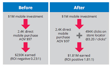
RadioShack launched its mobile site in 2011, streamlining it to make it easier for shoppers to quickly find products and services. It includes a mobile, touch-optimized store locator with click-to-call and GPS functionality. After its launch, the retailer found the average order value increased by 30 percent.

An analysis of four months’ worth of data completed by RadioShack with Mindshare, its agency, found that 36 percent of clicks were on its store locator page. Based on internal data, they estimated that 40 to 60 percent of clicks on its store locator resulted in visits to a physical store. Of those who did shop at a store, 85 percent made a purchase.

Before this study, RadioShack had only tracked conversion on its mobile site; it didn’t have great visibility into how mobile search affected in-store sales. “It wasn’t a good way to capture the whole conversion process and how users are interacting. The study was trying to follow the customer through the whole experience,” says Lisa Little, RadioShack search marketing manager.

READ MORE:  RadioShack and Adidas Find Store Locators Ring Up Sales | ClickZ.


Feb 192013
 

android-ios

Justin Ferrell, mobile strategist and developer at Digital Relativity, explains the fundamental differences between the user expectations of today’s most popular mobile platforms, and illustrates how developers can build cross-platform applications without neglecting the user experience

The words “cross-platform development” have a somewhat negative connotation within the mobile development community. When we think cross-platform, we immediately think of compromising designs and user experiences, with poor performance that caters to the lowest common denominator of device. There are so many people doing cross-platform development badly that we’ve started to assume that all cross-platform development is bad.

Like all things, there are bad examples of cross-platform development and design. But there are also some very good examples of applications that use cross-platform technologies and techniques.

Companies like Xamarin offer great cross-platform development products

Before we can understand going across platforms, it’s important that we understand the platforms themselves, the fundamental differences and what sort of experience they create for the end user.

READ MORE >> Dos and don’ts of cross-platform mobile design


Feb 112013
 

internet-web

Attention marketing directors, creative directors and everyone else who cares about how well tuned their website is for mobile devices. Uh, that’s everyone, right?

Is your current website properly designed to render perfectly on all mobile devices? If our casual surfing observations are any indication, the answer is a resounding no.

If you haven’t already, you should seriously be considering how to revamp your digital marketing strategy to cope with the mobile takeover. Make no mistake about it, the mobile revolution isn’t coming. It’s already arrived.

Creating a web strategy to deal with the rise of mobile devices boils down to three primary options: Developing a native app, designing a separate mobile site, or recalibrating your primary website with responsive design.

MORE:  Why Your Next Website Makeover Should Incorporate Responsive Design.


Jan 092013
 

 internet-web

If design and content strategy stops when the build phase starts it’s time to rethink your process. The role of a modern front-end developer goes beyond following pre-defined blueprints. An iterative, agile-like approach is vital to account for responsive design challenges that inevitably arise as a website takes shape.

With that in mind here are my 5 tips for responsive builds:

1. Utilise breakpoint zero

Start by writing HTML in a semantic and hierarchical order. This is dictated by content priority, and a bit of common sense.

MORE:  5 Tips for Responsive Builds – David Bushell – Web Design & Front-end Development.


Jan 032013
 

facebook

After eight years focused on user growth and building the foundations of its platform — News Feed, location and Open Graph, among others — Facebook went into 2012 prepared to go public and become more serious about monetization.

The social network launched several new ad types and began a number of other potential money-making ventures. Here’s a look at Facebook’s monetization efforts last year and how they might evolve in 2013.

News Feed/Mobile Ads

News Feed ads, starting with Sponsored Stories, launched in January. These same ad types came to the mobile feed in March, and over time, the social network began allowing page post units and other non-social ads. Mobile app installs came to the feed in August. Facebook previously allowed feed-based ads in 2007 but it had never shown ads on mobile devices until this year. Now, the social network is earning $4 million a day from News Feed ads, with three-fourths of that from the mobile feed.

MORE:  How Facebook’s latest monetization efforts may take shape in 2013.


Oct 032012
 

Apple makes a big fuss when discussing the razor sharp images of the iPhone’s Retina display, but now there’s a new resolution champ that tops Apple’s offering by a solid third.

Sharp’s new 5-inch screen is the first display to offer 1920×1080 “full HD” video resolution in a size small enough to use in a smartphone. Compare that to the iPhone 5’s 1136×640 4-inch display, and it becomes clear that this is a pretty big step. Crunch the numbers, and you’ll find that the Sharp screen manages to cram in 443 pixels per inch, compared to the iPhone 5’s 326 ppi.

MORESharp’s 1920×1080 phone screen makes a Retina display look fuzzy | DVICE.


Sep 262012
 

DudaMobile in February reported that nearly 20% of visits to small business sites led to an immediate call to the business e.g. with click-to-call, with some local businesses skewing much higher e.g., pizzerias at 32%, car services at 27.8%. But businesses have to earn that call with a mobile-friendly site that puts that phone number above the fold and in eyeshot. Google concludes from the new study that non-mobile friendly sites actually damage a company’s reputation: 36% of respondents said they felt like they’ve wasted their time by visiting those sites, and 52% of users said that a bad mobile experience made them less likely to engage with a company.

MOREGoogle Warns, 6 in 10 Will Leave Your Mobile-Unfriendly Site – MarketingVOX.