May 282013
 

 CSS3_logo

Knowledge needed: Basic HTML, Basic CSS/CSS3

Requires: Code Editor

Project time: About an hourDOWNLOAD SOURCE FILESVIEW DEMO

Create a modern CSS3 hover effect by using CSS transitions, transforms and delays

A CSS transition gives us the ability to animate changes to a CSS property value. This can be used to smoothly change a value, and by using transition delays we can cue the transition of elements. A CSS transform allows us to transform elements in two or three dimensional space. In this tutorial, we will be using 2D transformations.

MORE:   Create modern CSS3 hover effects | Tutorial | .net magazine.


May 142013
 

 HTML5_Logo_512

Sam Hampton-Smith shows how to use CSS3 transitions and animations to create a kinetic typography motion graphic piece, timed to match an HTML5 audio clip

Kinetic typography is a popular way to add impact to a song or audio clip by accentuating the lyrics or script to emphasize phrases, build suspense or help tell a story. The usual method is to set type in Photoshop or Illustrator and use After Effects or Apple Motion to animate words, revealing them in time to the music.

In this tutorial, we’ll use kinetic typography to create a simple conceptual art piece, timed to a song provided by power pop band, Be Like Pablo. Rather than using After Effects, we’ll take advantage of CSS3 animations and transitions to create the piece with standard web tools: HTML5 and CSS3 for the animation and audio and a smattering of JavaScript (we’re using jQuery but you could use straight JS if you prefer) to add classes to various elements at appropriate times.

MORE: Make a kinetic typography video with CSS | Tutorial | .net magazine.


Jan 172013
 

javascript-logo

Karl Schellenberg demonstrates how to stagger full-site animations with CSS3 and JavaScript through page scrolling

When we redeveloped our new website, we decided to use CSS3 animations to provide an impressive and interactive site experience. However, we struggled to time the animations to trigger at the right time.

Because animated elements “below the fold” (depending on the screen resolution) animate on page load, some animations had already played before the user had chance to scroll to them.

To prevent this, we delay the animations until the user can see them. The animations trigger as the user scrolls down and the elements come into view, which creates a staggered effect. To do this we used specific classes for CSS3 Transitions and some JavaScript to trigger the correct elements during scrolling.

MORE:  Getting CSS animations to trigger at the right time


Aug 032012
 

This month, Mark Penfold’s round-up of the best new tools ranges from cutting-edge experiments to down-to-earth utilities. Give them a try: they’re all free

This month sees a mix of the boundary-pushing and the practical. The two aren’t such strange bedfellows as they might appear, at least when it comes to web development – for the simple reason that just about any attempt to stretch the realms of the possible will cause a few holes to appear in what you’ve got. And that’s where the practicalities come in.

So we’ve got a 3D CSS3 lighting rig and a PNG image cruncher, a media production suite and a cookie cutter for jQuery. You can’t afford to lose sight of the details when you’re trying to make changes to the big picture.

What’s more, many of the dev community’s brightest stars are associated with detail work. Take, for example, the Modernizr project, also updated this month. When it actually comes to building the web, it isn’t content that is king: it’s utility.

MORE:  New tools for web design and development: July 2012 


Oct 192011
 

Vintage fonts and retro designs are all the rage on the web. Illustrator and designer Naomi Atkinson reveals some quirky Photoshop and CSS tricks to give your designs a retrotastic feel


via Create awesome retro designs with Photoshop and CSS | Tutorial | .net magazine.

Sep 132011


From the basics of animation keyframes and to expert animation tips that will save you many a headache, Estelle Wyl, web developer and author of HTML5 and CSS3 For the Real World, takes you on a tour of all you need to know to get up and running with CSS3 animations

via A masterclass in CSS animations | Tutorial | .net magazine.

Sep 012011


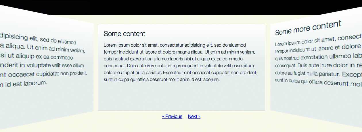
Explore the new CSS transforms features and create a 3D carousel that rotates from panel to panel. Paul Hayes takes you through the project and explains browser support and fallbacks along the way

via Build a rotating 3D carousel with CSS | Tutorial | .net magazine.

Aug 252011
 

The word gradient has many different meanings, but in CSS, a gradient is strictly defined as a gradual transition between a range of (at least two) colours. CSS gradients are a fairly recent development but have already been through a number of changes. They were originally proposed by the WebKit team in April 2008, modified from the syntax proposed for the canvas element in HTML 5.

The W3C’s CSS Working Group later proposed a modified syntax, and this syntax is in the latest revisions of the Image Values Module. The first browser to implement this was Firefox 3.6, and the WebKit team weren’t far behind, so Safari 5.1 and above and recent versions of Chrome also use this syntax (The Book of CSS3 explains the old WebKit implementation fully).

via Master CSS gradients | Tutorial | .net magazine.

Aug 232011
 

As introduced/coined by Ethan Marcotte in both his article “Responsive Web Design” as well as his recently released book, one needs three elements to make a site responsive:

A flexible/fluid grid

Responsive images

Media queries

There are plenty of other great articles that cover motives, concepts, and techniques regarding responsive web design, so we’ll keep the focus of this article on some top tools that will help you become responsibly responsive.

via 21 top tools for responsive web design | Feature | .net magazine.

Jul 112011
 

 Ethan Marcotte coined the term responsive design to describe the process of using liquid layouts and media queries to scale websites so that they fit any screen size.

via Tips, Tricks and Best Practices for Responsive Design | Webmonkey | Wired.com.

Forget Photoshop, build your comps in the browser. It’s virtually impossible to mock up liquid layouts in Photoshop, start in the browser instead.

Scale images using img { max-width: 100%; }. For very large images, consider using something like Responsive Images to offer the very smallest screens smaller image downloads and then use JavaScript to swap in larger images for larger screen.