Oct 122011


Pinoy-Canadian web developer AJ Batac put together a drop dead simple javascript bookmarklet today that makes it easy to share any webpage youre visiting in Google Plus, along with a comment. The way it works is that your account publicly +1s the page, then gives you the option to share it with whatever Circles you choose.

via You Should Grab This New Google Plus Sharing Bookmarklet, It is Oh So Easy.

Oct 072011


First it was solving a complex protein puzzle related to the HIV virus, and this time it is the 40,000 registered users of the game Planet Hunters who have identified 69 potential new planets and two very strong candidate planets outside the Earth’s solar system. We think we see a new trend in the making.

This latest breakthrough involved taking data retrieved from NASA’s Kepler space telescope that has been recording images at the mind-boggling pace of one image every 30 seconds since 2009. The goal? To find potential habitable planets outside our solar system. Trained on the Cygnus constellation — located on the northern plane of the Milky Way — the telescope recorded over 200,000 stars. That’s a lot of space people.

The good scientists over at NASA know a problem when they see one. That amount of data is simply too much for a small group to handle, so like others before them they cried, “Houston, we have a…” wait! Let’s change that to “Gentlemen, to the gamers!”

Planet Hunters challenges players to analyze data by viewing the actions of stars over time.

via Gamers are at it again, this time discovering new worlds | DVICE.

Oct 072011
 

While some publishers proactively stopped offering pop-up ad space, the real reason pop-ups went away was browser developers built pop-up blockers into the system. However, the reason behind the blocking wasn’t based on offensive messaging, but rather the fact that it really impeded the flow for the end user. Imagine if while watching a television program the channel changed to play a commercial and the only way to get back to the program was to change the channel back. Sure, your remote is probably close by and it’s easy to click, but it would have interrupted the flow for the consumer and, in turn, annoys more than engages.

via 4 ways you’re annoying your online audience – iMediaConnection.com.

Oct 052011


Facebook’s new Timeline design gives users a large “cover photo” space at the top of the page. We think this revamp is a great opportunity to get creative with your profile presentation.

We recently asked the Mashable readership to share how they’ve played with the new design. Here are 10 examples of Facebook Timeline cover photo designs we think are particularly creative, and that offer a witty take on the new layout.

via 10 Facebook Timeline Designs That Will Blow You Away [PICS].

Oct 042011


Need more motivation for your next run? How about a pack of snarling zombies snapping at your heels?

Zombies, Run!, to be released early next year for iPhone and Android, is an app in the style of Runkeeper, with an exciting undead twist.

You start up the app, plug in your headphones and go for a run. As you begin to sprint, jog or walk to your destination of choice, you’ll hear the narrated story of a zombie-infested, dystopian future. You’re a “runner” in this world, which means that your job is to go out and collect supplies like ammo, medicine and batteries for your ragtag base of human survivors. The more you run, the more stuff you’ll acquire.

via Zombies, Run! Makes Your Workout a Race for Survival | GameLife | Wired.com.

Oct 042011


Facebook is now closer than ever to becoming the phone book for the internet. The site recently launched a Directory of people, Pages, and Places to allow users to find friends and official entities by name. The People Directory displays an alphabetized list of all users who’ve made public search listings available in their privacy. In addition to browsing by first letter, the Pages and Places Directories surface the most popular presences first for speedy discovery

Until now, users could only find people, Pages, and Places through search, the personalized Find Friends feature, and the buried Pages Browser. Directories will assist users that are looking for things with common names or that they’re not positive about the spelling of. Though certainly slower than search, it could become a powerful last resort for people intent on finding someone or something on Facebook.

via To Complement Its Search Engine, Facebook Launches People, Pages, and Places Directories.

Oct 042011


Naomi Robbins, the consummate modernist, spends her presentation extolling clarity, objectivity, and a form follows function philosophy that comes with a number of simple guidelines to follow. DO: make the data stand out, eliminate unnecessary dimensions, or try a dot plot instead of a bar graph sometime. DON’T: use novel shapes that are difficult to compare in size, have too many zeros, or add ornament just to be attractive. Through a crystal goblet of statistical graphics, we should see nothing but the facts.

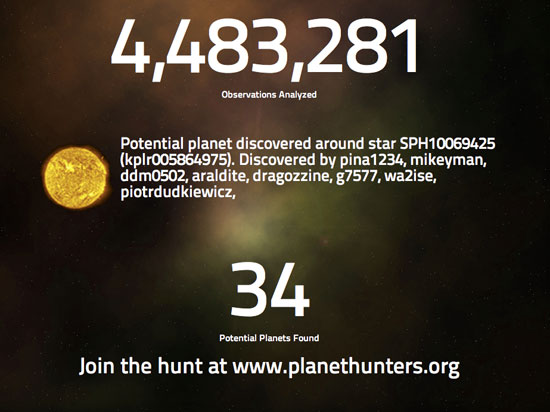
Robbins makes a point of distinguishing more technical graphics from art. While data art may not really inform, the examples still evoke ooh’s and ahh’s from a knowledgeable, statistically literate crowd. There is beauty in truth, and a few of the later speakers explain how it’s a truth that can be bent, or at least used expressively.

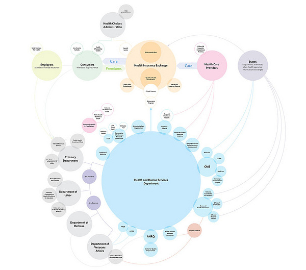
Noah Iliinsky, of Complex Diagrams and Designing Data Visualizations, takes our focus from the clear and factual to good storytelling. While data has its properties that need to be honored, he places equal emphasis on knowing your audience and being able to state exactly what it is you want to convey. In terms of design advice, Iliinsky is slightly less explicit about established rules. He borrows a quote from Moritz Stefaner, that “position is everything, color is difficult.” No one wants to see arbitrarily chosen, confusing color schemes, but it’s no reason to shy away from it completely.

via Strata NY 2011 [Data Visualizations] – The Subjectivity of Fact – information aesthetics.

Oct 042011


The Function Of Textures

We love texture on the Web for a multitude of reasons. Design decisions shouldn’t be made simply on the basis of, “Oh, well. It looks good.” Design should serve a purpose, and each decision about texture should be made by weighing the pros and cons. Let’s start by going over some of the key benefits.

via The Whys And The Hows Of Textures In Web Design – Smashing Magazine.

Oct 032011


By now it’s become fairly obvious that Google’s new social network, Google+, is here to stay (unlike some of the company’s past efforts at being social): depending on which estimates you believe, Google+ may have as many as 50 million registered users, which is not bad for a three-month old product. And the company has made it clear that it wants to use Google+ as a kind of identity platform for other things — hence the importance of its controversial “real name” policy. But it wasn’t obvious just how much was riding on the new network until recently, thanks in part to some comments made by vice-president of product Brad Horowitz, who said that in the future, Google+ and Google will effectively become inseparable.

via It’s official: Google+ will be connected to everything — Tech News and Analysis.

Sep 302011


I originally assumed that Poking was merely flirting: A subtle way to get the attention of another Facebook user. And yet just under half of my Pokes are from males — most of them seemingly straight (or are they?). So again: What does a Poke mean? And should we take a Poke to be flirtatious when it could, in my case, just as easily mean “Hey, I just sent you a press release about my new app”?

Facebook doesn’t even know what a Poke means, with the Help page reading: “The poke feature can be used for a variety of things on Facebook. For instance, you can poke your friends to say hello.” Ah, so they’re either saying hello, or flirting, or pestering … or something completely different.

via Facebook, It’s Time To Kill the Poke.