Sep 222011


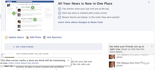
Users part of the initial roll out of the news feed redesign announced yesterday are also receiving several other unannounced changes to Facebook’s interface. These include an expansion of the character limit on posts from 500 to 5,000, a rollout of the floating navigation bar we saw tested last week, the ability to edit bookmarks in the home page’s left navigation bar, and a more convenient way to leave birthday greetings. Over the last few days Facebook has also buried the poke button within a drop down menu, and removed the ability to accompany a friend request with a message.

By launching these interface alterations now rather than amongst other sweeping updates at the f8 developer conference on Thursday, Facebook may be able to reduce the shock to users. The timing will also help the site keep attention focused on Platform-related updates that directly impact developers. Unfortunately, the combination of so many changes with the prompts necessary to explain them gives the home page a foreign look that may turn off some users.

via Facebook Increases Character Limit on Posts to 5000, Rolls Out Floating Navigation Bar and More Amid Unrest.

Sep 202011


Prototyping tools can be restrictive and it’s becoming more important that designers know how to code up their concepts, so Leisa Reichelt organised a workshop teaching how to build prototypes in HTML and CSS. Here Anna Debenham summarises what she taught on the Code Fitness day

If you already know how to build a basic web page, you probably won’t learn anything here. But if you don’t, or your knowledge is from back in the days of table-based layouts, this will give you a good grounding in building prototypes in HTML and CSS.

via Building prototypes in HTML and CSS | Tutorial | .net magazine.

Sep 192011
 

Divya Manian, web opener for Opera Software, provides an exclusive look behind the CSS Working Group and the lowdown on 13 exciting CSS3 specs being discussed right now. If you want to know the future of CSS, read on!

Most of the fancy CSS features that you use in your style sheets are defined by a group of people who form the part of the CSS Working Group. Typically this occurs when members of the group/web developers bring a proposal for a feature in a CSS specifications — on the www-style mailing list typically — or a change in the definition, it gets discussed and then a few implementors (typically browsers such as Opera, Chrome, Safari or Firefox) implement it (or implementations are brought to discussions to become part of a specification), more discussions ensue and so on.

via Exclusive preview of the hottest CSS specs | Feature | .net magazine.

Sep 162011


Boston Globe has launched a snazzy new website, in an attempt to create a more immersive news-reading experience, on a platform that appropriately features long-format journalism and better promotes a subscription-based business model. That’s all lovely for readers, but the site also has a modern, adaptive design that will make many web designers swoon (or go green with envy).

Load up the site and drag the window about; note how the newspapery and readable design effortlessly reworks its columns, and how the navigation works in its narrowest form. Lovely. We wanted to find out more, so quizzed some of the people behind the build: Filament Group’s partner Patty Toland and two designer/developers, Scott Jehl and Mat Marquis.

via Behind Boston Globe’s responsive layout | News | .net magazine.

Sep 162011


Today Google launched the beginnings of an API for the company’s Google+ social network.

APIs allow outside developers to connect with and build applications on top of web services like Facebook, Twitter and now Google+. In fact much of the success of Twitter and Facebook is a result of both services’ developer APIs. If Google+ is to have any hope of catching its competitors it needs a strong API.

via Google Rolls Out a Developer API for Google+ | Webmonkey | Wired.com.

Sep 162011
 

Designing a great user interface can be a challenge, even for the most seasoned designer. Countless factors need to be taken into consideration and the difference between a good UI and a great one often boils down to paying close attention to the smallest details.

When undertaking such an important and often complex task, it’s helpful to have some handy resources for both education and inspiration. We’ve put together a list of some of our favorites below. Since we can only scratch the surface of the wide variety of UI design resources available, we invite you to share yours in the comments.

via 9 Essential Resources for User Interface Designers.

Sep 132011


Writing content for web users has its challenges. Chief among them is the ease with which your content is read and understood by your visitors (i.e. its readability).

When your content is highly readable, your audience is able to quickly digest the information you share with them — a worthy goal to have for your website, whether you run a blog, an e-store or your company’s domain.

Below are a handful of dead-simple tips and techniques for enhancing the usability and readability of your website’s content.

via 7 Best Practices for Improving Your Website’s Usability.

Sep 132011


From the basics of animation keyframes and to expert animation tips that will save you many a headache, Estelle Wyl, web developer and author of HTML5 and CSS3 For the Real World, takes you on a tour of all you need to know to get up and running with CSS3 animations

via A masterclass in CSS animations | Tutorial | .net magazine.

Sep 082011


Think carefully before choosing a gallery-style layout for your website. For example, it’s certainly not appropriate for sites that really ought to be read sequentially. Portions of your website – such as portfolios, links or even notebook-style blogs – can be a great place to explore the technique, but use it with care. If your content isn’t easily scannable or lacks clear and quickly received content then you’ll end up creating stumbling blocks for your visitors. After that, they’ll just leave with a sour taste in their mouths.

via Five killer ways to use a gallery style | Feature | .net magazine.

Sep 072011


“The idea is a very mature way of thinking. It’s almost ingrained as a designer: this is how we approach layout. But we’ve tried to make it work on the web by basically inventing a page, like a best fit. We’ve created a page in a medium where there are no edges, there is no page. The web is different. So I’ve thought up three rules, which I think we need to apply to modern web design. It’s a complete reversing of the way of thinking about it.”

via Mark Boulton on layouts and grid systems | Interview | .net magazine.